
data and product
information design and UX for data course.
9+ hours of training so your data team can design better dashboards on its own.
what the service is.
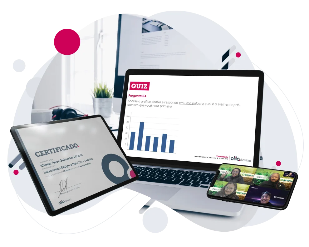
An intensive course of more than 9 hours that trains data teams in information design and UX applied to data products. The content covers data visualization, user-centered design principles and how to communicate complex information.
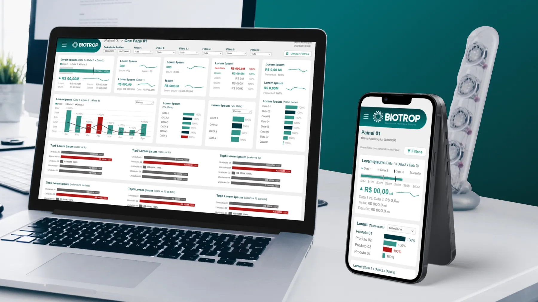
The expected result is a team that builds consistent dashboards without needing a designer on every screen. Danone Brasil and Biotrop took the course as part of the BI projects we did together.
what you get.
- 9+ hours of training, module by module
- Open channel with the mentors after the course
- Certificate of completion
how it works.
the information design and UX for data course process, step by step.
Each step has a clear result and ends with validation, so nobody finds out only at the end what was missing.
request a proposal- step 1
dates and participants.
We agree on the schedule and the number of people per class with the client, for better absorption.
- step 2
course format.
We choose the format: remote or on site.
- step 3
delivery.
3-hour sessions per day, module by module, with room for questions.
- step 4
follow-up.
After the course, participants keep an open channel with our mentors.
- step 5
certificate.
Anyone who completes all modules receives a certificate of completion.

contact.
let's talk about information design and UX for data course.
Tell us the context of your project. We reply with the next steps.
- contact@olilodesign.com
- WhatsApp +55 11 97697-6224
- Av. Paulista, 1636, suite 1504, Cerqueira César, São Paulo, SP, 01310-200, Brazil